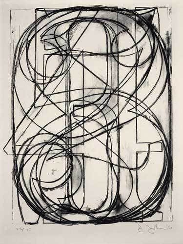
In 1960, Jasper Johns created his lithograph “0 through 9”, using stone in black on Arches paper. His lithograph uses several principles of design which supports the design elements to create an impressive piece of art work. The principles utilized include proportion, rhythm, and balance.
Viewers viewing “0 through 9” immediately recognized there is proportion. The lines which form the numbers cover the whole paper. Proportion refers to size in relationship between parts of a whole. (137) The many lines used to in creating the numbers “0 through 9” create rhythm. Rhythm is based on repetition. (141) Those viewing “0 through 9” are immediately drawn to the visual weight of the lithograph being equally distributed. Johns employs symmetrical balance. By placing an imaginary line down the middle, one can see the sides are equal. Symmetrical balance is equal weight. (125)
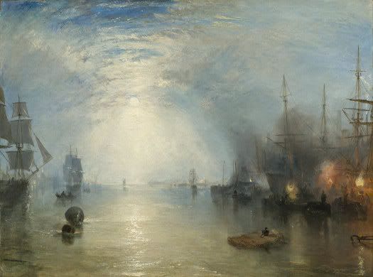
Joseph Mallord William Turner created his oil on canvas painting the “Keelmen Heaving in Coals by Moonlight” in 1835. Turner uses the design principles of emphasis, unity, and variety to support the design elements in his painting.
In this painting, Turner uses emphasis which grabs the viewer attention with the moon, and its reflection on the water leads the way to it. This can be seen by Turner's use of color to lighten and darken the sky. Emphasis means that our attention is drawn more to certain parts of a composition than others. (134) Turner also uses unity and variety in this painting by creating a visual harmony of the harbor and ships as well as the smoke coming from the coal mines. Unity is a sense of oneness, of things belonging together and making up a coherent whole. (122) Variety is the difference in the art work which provides interest. (122)
In conclusion, both pictures use very different principles. Jasper Johns art work exhibits symmetrical balance in contrast to Turner. Turner uses emphasis in his painting to draw attention to certain parts while Johns does not.
Wednesday, September 26, 2007
Monday, September 24, 2007
Creative Blog
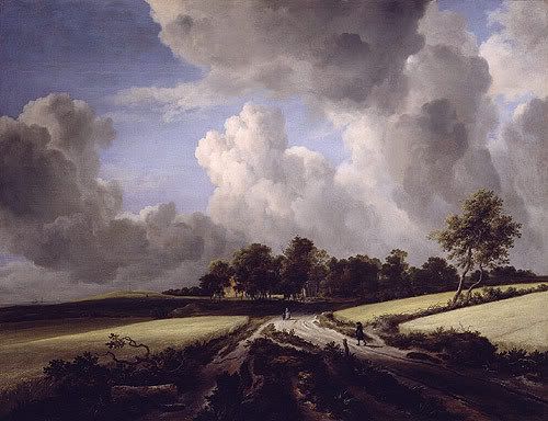
Wheat Fields, ca. 1670 Jacob Isaacksz. van Ruisdael (Dutch, 1628/29–1682)
I throught this was a beautiful picture because of the trees in the distance and the many clouds in the sky which appear to be moving. This picture is an example of Asymmetrical Balance where as the two sides do not match although they appear to.
______________________________________________
Georges Fouquet (French, 1862 – 1957), Designer Corsage Ornament. ca. 1923. Jade, onyx, diamonds, enamel, and platinum
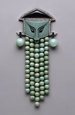
This is not a beautiful piece of art as much as it is usual. It is a perfect example of Symmetrical Balance because if you place a line down the middle, both sides would be mirrored.
______________________________________________
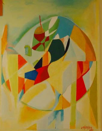
Universe by Vladimir Panian
oil painting on canvas
I choose this picture because I liked the way the artist used shapes and colors as his visual elements. This picture uses the visual elements of primary and secordary colors as well shapes.
______________________________________________
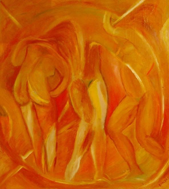
Swirl by Vladimir Panian
oil painting on canvas
I choose this picture because of the implied shapes the artist uses to create the shape of the people. The visual elements of this picture is its use of the primary color yellow and secondary color of orange.
_______________________________________________
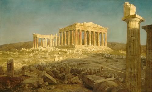
I like the way the artist chose to display the ruin buildings. In this painting, the artist use monochromatic harmonies. He uses one color thoughout the artwork. The artist also uses value by drawing the viewer eyes to look upon the only standing structure.
_______________________________________________
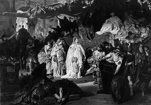
Thusnelda at the Triumphal Entry of Germanicus into Rome, ca. 1875
Karl Theodor von Piloty (German, 1826–1886)
I thought this was a very interesting painting. There is so much to see. I especially liked the way Theodor von Piloty created the value of lighting and darkening to emphasis the woman and child in the center of the painting.
________________________________________________
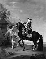
The Empress Elizabeth of Russia (1709–1762) on Horseback, Attended by a Page
Georg Christoph Grooth (German, 1716–1749)
Oil on canvas
I chose this picture because when we were reading about themes in artwork, I felt this picture was a perfect example of the social order theme. You have the Page attending to the Empress Elizabeth needs.
_______________________________________________
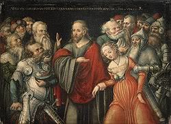
Christ and the Adulteress, mid-1540s
Lucas Cranach the Elder (German, 1472–1553)
Oil on wood
I chose this painting because it portrays an woman adulteress as the men look on to bear witness. The design element used in the artwork is implied line. This is seen by the way in which the hand is used to point to the woman adulteress.
_______________________________________________
The Martyrdom of Saint Barbara, ca. 1510
Lucas Cranach the Elder (German, 1472–1553)
Oil on wood
I chose this picture because it shows the Martyrdom as she is about to be executed as several men look on. The artist uses monochromatic harmony as the design element in this painting.
_________________________________________________

Henry MooreBritish, b. Castleford, England, 1898 - 1986
Family Group: Maquette No. 4, (1944, cast 1956)Bronze
This is an interesting piece to me because when I look at it I see family and togetherness. This piece represents a 3 dimensional element of design.
___________________________________________________
Nam June Paik
American, b. Seoul, Korea, 1932 - 2006
Video Flag, (1985-1996)
70 video monitors, 4 laser disc players, computer, timers, electrical devices, wood and metal housing on rubber wheels
I find this to be a very interesting piece of artwork because the monitors and other equipment is used to represent the American flag as well serving as an educational tool. There is a continuous run of every U.S. president from Harry S. Truman to Bill Clinton. The design element used is pattern being repeated.
______________________________________________________

Alexander Calder
American, b. Lawnton, Pennsylvania, 1898 - 1976
Spiral, 1970
Gouache and ink on paper
I chose this artwork because of its spiraling effect which is created by the implied diagonal lines. The other elements of design Calder used are his repeated pattern and use of primary and secondary colors.
_____________________________________________________
Gustave Caillebotte, Factories at Argenteuil, 1888
I like this picutre because you can see the reflections on the water. The artist uses thick brush strokes to create the water and sky. The technique is impasto.
______________________________________________________
Jean-Baptiste-Camille Corot
French, 1796 - 1875
Beach near Etretat, c. 1872
oil on canvas
This is a beautiful beach and I especially liked Corot use of thick brush strokes in creating the landscapes of the beach (sand and greeny).
______________________________________________________
Winslow Homer, American, 1836 - 1910
The Coming Storm, 1901
watercolor over graphite
I looked at this picture and I was able to determine the medium used prior to looking at the artwork description. He uses primary color blue for the water.
______________________________________________________
Winslow Homer, American, 1836 - 1910
Four Boys on a Beach, c. 1873
graphite with watercolor and gouache on wove paper
I like this painting because of the kids on the beach sitting on the sand.
______________________________________________________
Georgia O'Keeffe, American, 1887 - 1986
Jack-in-the-Pulpit No. IV, 1930, oil on canvas
I chose to put some of O'Keeffe artwork on display because I love the way she takes the simpliest subject/object and creates a great work of art. This is a beautiful abstract look at a flower. Below our some other pieces of artwork by her.
_______________________________________________________
Georgia O'Keeffe, American, 1887 - 1986
Black White and Blue, 1930, oil on canvas
O'Keeffe uses the design elements of vertical and diagonal lines for movement and direction. The diagonal lines imply action.
_____________________________________________________
Georgia O'Keeffe, American, 1887 - 1986
The Shell, 1934, charcoal on laid paper
For this artwork, O'Keeffe uses the color harmony of monochromatic harmony. In this composition she uses one color to create the color of the shell.
_____________________________________________________
Georgia O'Keeffe, American, 1887 - 1986
Jack-in-Pulpit Abstraction - No. 5, 1930, oil on canvas
O'Keeffe uses primary and secondary colors; red and green.
_____________________________________________________
Bacchanal: A Faun Teased by Children, 17th century (ca. 1616–17)
Gian Lorenzo Bernini (1598-1680), Sculptor
I choose this sculptor because of the details Bernini put in creating the faun and children. The element of design used is three dimensional. Bernini used implied lines to draw your attention to the children he is playing with.
_____________________________________________________
I chose the next three paintings because they were done during the Romanticism movement in art history. Each is a beautiful piece of artwork.
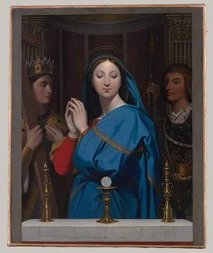
The Virgin Adoring the Host, 1852
I found this to be an interesting painting of the Virgin. In this painting, the artist uses primary colors of blue and red to draw your eyes to the virgin. The artist also uses value. The image of the virgin is lighten while the figures to the right or left are darken.
____________________________________________________
 Jean-Auguste-Dominique Ingres (French, 1780–1867), Oil on canvas
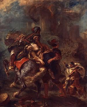
The Abduction of Rebecca, 1846
Eugène Delacroix (French, 1798–1863)
Oil on canvas
This is an interesting painting. The artist uses primary color red as well as implied lines to create movement and direction. You see this when looking at the direction of the hand.
______________________________________________________
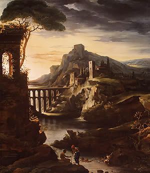 Evening: Landscape with an Aqueduct, 1818
Jean-Louis-André-Théodore Gericault (French, 1791–1824)
Oil on canvas
I especially like the way the artist shows value by drawing your attention out to the distant.
____________________________________________________

This is such a beautiful bed and breakfast. Looking at this picture makes going there very inviting. I especially like the way the lights focus in on the windows.
_______________________________________________________
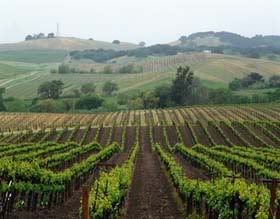
I like this picture because of the vineyards. This picture has implied lines allowing your eyes to follow the path of the vineyard. I also like the atmospheric perspective of seeing the rolls of vineyard in the distance.
___________________________________________________________
I chose Durand because he also does landscapes. Below are two beautiful pieces from him. I just enjoy the atmospheric perspective element of art which is used in both these paintings. The viewers eyes are drawn to look at the mountains in the distance. They appear farther away in the distance are blurred, become indistinct and misty. He also uses secondary color green. In addition, he uses the design element value; lighten or darken to highlight the cows grazing as well as the body of water.
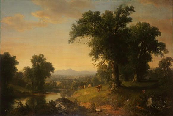
Asher Brown Durand
American, 1796 - 1886
A Pastoral Scene, 1858
oil on canvas
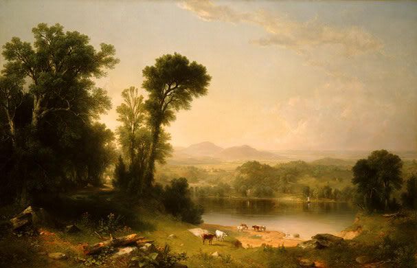
Asher Brown Durand
American, 1796 - 1886
Pastoral Landscape, 1861
oil on canvas
_____________________________________________________
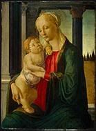
Sandro Botticelli
Florentine, 1446 - 1510
Madonna and Child, c. 1470
tempera on panel,
This is a beautiful painting. The prinicple of design is emphasis. The viewer is immediately drawn to Madonna and the Child. They are the focus point of the painting. Botticelli uses primary colors of blue and red for Madonna's clothing.
_______________________________________________________
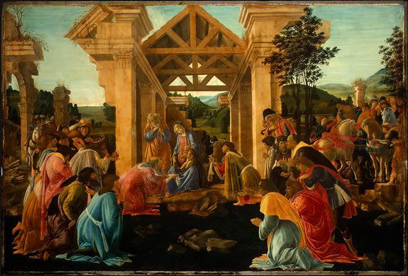
Florentine, 1446 - 1510
The Adoration of the Magi, c. 1478/1482
tempera and oil on panel, painted surface
I chose this painting because of the religious aspect is stressed. You see this looking at the people as they neil in prayer. Element of design use is color. Florentine use primary and secondary colors. Design principle used is emphasis. The structure in the middle of the painting stands out from the people as the neil in pray.
I throught this was a beautiful picture because of the trees in the distance and the many clouds in the sky which appear to be moving. This picture is an example of Asymmetrical Balance where as the two sides do not match although they appear to.
______________________________________________
Georges Fouquet (French, 1862 – 1957), Designer Corsage Ornament. ca. 1923. Jade, onyx, diamonds, enamel, and platinum
This is not a beautiful piece of art as much as it is usual. It is a perfect example of Symmetrical Balance because if you place a line down the middle, both sides would be mirrored.
______________________________________________
Universe by Vladimir Panian
oil painting on canvas
I choose this picture because I liked the way the artist used shapes and colors as his visual elements. This picture uses the visual elements of primary and secordary colors as well shapes.
______________________________________________
Swirl by Vladimir Panian
oil painting on canvas
I choose this picture because of the implied shapes the artist uses to create the shape of the people. The visual elements of this picture is its use of the primary color yellow and secondary color of orange.
_______________________________________________
I like the way the artist chose to display the ruin buildings. In this painting, the artist use monochromatic harmonies. He uses one color thoughout the artwork. The artist also uses value by drawing the viewer eyes to look upon the only standing structure.
_______________________________________________
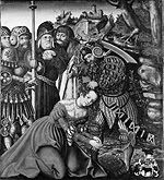
Thusnelda at the Triumphal Entry of Germanicus into Rome, ca. 1875
Karl Theodor von Piloty (German, 1826–1886)
I thought this was a very interesting painting. There is so much to see. I especially liked the way Theodor von Piloty created the value of lighting and darkening to emphasis the woman and child in the center of the painting.
________________________________________________
The Empress Elizabeth of Russia (1709–1762) on Horseback, Attended by a Page
Georg Christoph Grooth (German, 1716–1749)
Oil on canvas
I chose this picture because when we were reading about themes in artwork, I felt this picture was a perfect example of the social order theme. You have the Page attending to the Empress Elizabeth needs.
_______________________________________________
Christ and the Adulteress, mid-1540s
Lucas Cranach the Elder (German, 1472–1553)
Oil on wood
I chose this painting because it portrays an woman adulteress as the men look on to bear witness. The design element used in the artwork is implied line. This is seen by the way in which the hand is used to point to the woman adulteress.
_______________________________________________
The Martyrdom of Saint Barbara, ca. 1510
Lucas Cranach the Elder (German, 1472–1553)
Oil on wood
I chose this picture because it shows the Martyrdom as she is about to be executed as several men look on. The artist uses monochromatic harmony as the design element in this painting.
_________________________________________________
Henry MooreBritish, b. Castleford, England, 1898 - 1986
Family Group: Maquette No. 4, (1944, cast 1956)Bronze
This is an interesting piece to me because when I look at it I see family and togetherness. This piece represents a 3 dimensional element of design.
___________________________________________________
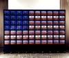
Nam June Paik
American, b. Seoul, Korea, 1932 - 2006
Video Flag, (1985-1996)
70 video monitors, 4 laser disc players, computer, timers, electrical devices, wood and metal housing on rubber wheels
I find this to be a very interesting piece of artwork because the monitors and other equipment is used to represent the American flag as well serving as an educational tool. There is a continuous run of every U.S. president from Harry S. Truman to Bill Clinton. The design element used is pattern being repeated.
______________________________________________________
Alexander Calder
American, b. Lawnton, Pennsylvania, 1898 - 1976
Spiral, 1970
Gouache and ink on paper
I chose this artwork because of its spiraling effect which is created by the implied diagonal lines. The other elements of design Calder used are his repeated pattern and use of primary and secondary colors.
_____________________________________________________
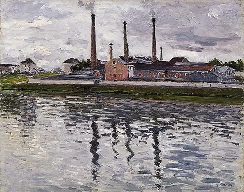
Gustave Caillebotte, Factories at Argenteuil, 1888
I like this picutre because you can see the reflections on the water. The artist uses thick brush strokes to create the water and sky. The technique is impasto.
______________________________________________________
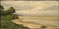
Jean-Baptiste-Camille Corot
French, 1796 - 1875
Beach near Etretat, c. 1872
oil on canvas
This is a beautiful beach and I especially liked Corot use of thick brush strokes in creating the landscapes of the beach (sand and greeny).
______________________________________________________
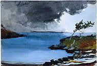
Winslow Homer, American, 1836 - 1910
The Coming Storm, 1901
watercolor over graphite
I looked at this picture and I was able to determine the medium used prior to looking at the artwork description. He uses primary color blue for the water.
______________________________________________________
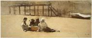
Winslow Homer, American, 1836 - 1910
Four Boys on a Beach, c. 1873
graphite with watercolor and gouache on wove paper
I like this painting because of the kids on the beach sitting on the sand.
______________________________________________________
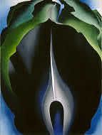
Georgia O'Keeffe, American, 1887 - 1986
Jack-in-the-Pulpit No. IV, 1930, oil on canvas
I chose to put some of O'Keeffe artwork on display because I love the way she takes the simpliest subject/object and creates a great work of art. This is a beautiful abstract look at a flower. Below our some other pieces of artwork by her.
_______________________________________________________
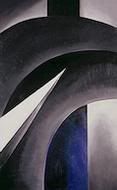
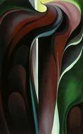
Georgia O'Keeffe, American, 1887 - 1986
Black White and Blue, 1930, oil on canvas
O'Keeffe uses the design elements of vertical and diagonal lines for movement and direction. The diagonal lines imply action.
_____________________________________________________
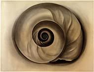
Georgia O'Keeffe, American, 1887 - 1986
The Shell, 1934, charcoal on laid paper
For this artwork, O'Keeffe uses the color harmony of monochromatic harmony. In this composition she uses one color to create the color of the shell.
_____________________________________________________
Georgia O'Keeffe, American, 1887 - 1986
Jack-in-Pulpit Abstraction - No. 5, 1930, oil on canvas
O'Keeffe uses primary and secondary colors; red and green.
_____________________________________________________
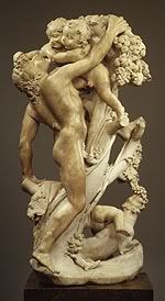
Bacchanal: A Faun Teased by Children, 17th century (ca. 1616–17)
Gian Lorenzo Bernini (1598-1680), Sculptor
I choose this sculptor because of the details Bernini put in creating the faun and children. The element of design used is three dimensional. Bernini used implied lines to draw your attention to the children he is playing with.
_____________________________________________________
I chose the next three paintings because they were done during the Romanticism movement in art history. Each is a beautiful piece of artwork.
The Virgin Adoring the Host, 1852
I found this to be an interesting painting of the Virgin. In this painting, the artist uses primary colors of blue and red to draw your eyes to the virgin. The artist also uses value. The image of the virgin is lighten while the figures to the right or left are darken.
____________________________________________________
Jean-Auguste-Dominique Ingres (French, 1780–1867), Oil on canvasThe Abduction of Rebecca, 1846
Eugène Delacroix (French, 1798–1863)
Oil on canvas
This is an interesting painting. The artist uses primary color red as well as implied lines to create movement and direction. You see this when looking at the direction of the hand.
______________________________________________________
Evening: Landscape with an Aqueduct, 1818Jean-Louis-André-Théodore Gericault (French, 1791–1824)
Oil on canvas
I especially like the way the artist shows value by drawing your attention out to the distant.
____________________________________________________
This is such a beautiful bed and breakfast. Looking at this picture makes going there very inviting. I especially like the way the lights focus in on the windows.
_______________________________________________________
I like this picture because of the vineyards. This picture has implied lines allowing your eyes to follow the path of the vineyard. I also like the atmospheric perspective of seeing the rolls of vineyard in the distance.
___________________________________________________________
I chose Durand because he also does landscapes. Below are two beautiful pieces from him. I just enjoy the atmospheric perspective element of art which is used in both these paintings. The viewers eyes are drawn to look at the mountains in the distance. They appear farther away in the distance are blurred, become indistinct and misty. He also uses secondary color green. In addition, he uses the design element value; lighten or darken to highlight the cows grazing as well as the body of water.
Asher Brown Durand
American, 1796 - 1886
A Pastoral Scene, 1858
oil on canvas
Asher Brown Durand
American, 1796 - 1886
Pastoral Landscape, 1861
oil on canvas
_____________________________________________________
Sandro Botticelli
Florentine, 1446 - 1510
Madonna and Child, c. 1470
tempera on panel,
This is a beautiful painting. The prinicple of design is emphasis. The viewer is immediately drawn to Madonna and the Child. They are the focus point of the painting. Botticelli uses primary colors of blue and red for Madonna's clothing.
_______________________________________________________
Florentine, 1446 - 1510
The Adoration of the Magi, c. 1478/1482
tempera and oil on panel, painted surface
I chose this painting because of the religious aspect is stressed. You see this looking at the people as they neil in prayer. Element of design use is color. Florentine use primary and secondary colors. Design principle used is emphasis. The structure in the middle of the painting stands out from the people as the neil in pray.
Wednesday, September 19, 2007
Activity #2: Write About It!
In 1960, Jasper Johns created his lithograph “0 through 9”, using stone in black on Arches paper. Johns employs lines in his lithograph. The lines are used to record the borders of the form in addition to conveying direction and motion. (83) By looking at the lines in the lithograph, one is able to recognized the diagonal lines; therefore, allowing the eyes to make out the numbers from 0 through 9. Johns also uses shapes. The shapes are two-dimensional with identifiable boundaries which allow us to see the numbers. (87)
Joseph Mallord William Turner created his oil on canvas painting the “Keelmen Heaving in Coals by Moonlight” in 1835. This painting uses the effects of atmospheric perspective in illustrating the illusion of moonlight breaking through the clouds to illuminates the sky and water. (113) Turner also uses light and color in this painting. Color is a function of light. (94) By using blue and white, Turner is able to show lightness and darkness within his painting.
The two pieces of art work I have chosen for this activity are very different. Where Johns art work is a collection of lines which convey direction and motion, Turner painting emphases the use of color as well as atmospheric perspective.
Tuesday, September 18, 2007
Activity #1
Joseph Mallord William Turner Keelmen Heaving in Coals by Moonlight, 1835
Jasper Johns (b. 1930) 0 through 9, 1960 lithograph (stone) in black on Arches paper
Jasper Johns (b. 1930) 0 through 9, 1960 lithograph (stone) in black on Arches paper
Subscribe to:
Posts (Atom)