Monday, November 12, 2007
EXTRA CREDIT
The color relationship of the "Assignment" list on Black Board consist of primary, secondary, and tertiary colors. Weeks 2 and 8 uses the primary color of red. While weeks 6 and 10 uses primary color of yellow. Week 4 uses the primary color of blue. Week 3 uses secondary color of orange. If you open the assignment for a specific week, for example Intro week one, you see primary colors of blue, and secondary colors of orange, green, and voilet. Where as week five, you will notice that the colors used are pink, light green, light blue, and purple which are tertiary colors. Tertiary colors are created when you mix primary and secondary colors together.
Sunday, November 11, 2007
ART 101 FINAL EXAM - MUSEUM PAPER
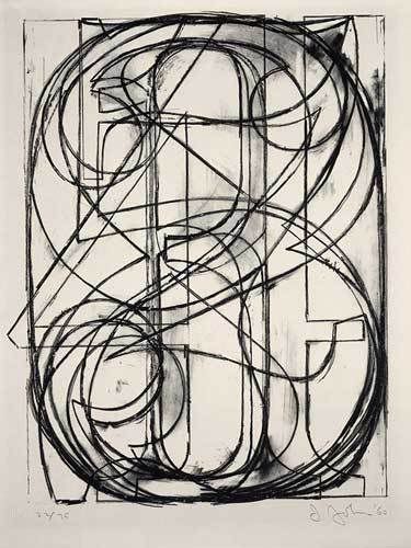
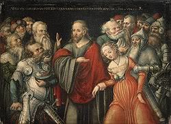
American born artist, Jasper Johns created his lithograph “0 through 9” in 1960, using stone in black on Arches paper. Joseph Mallord William Turner, British born, created his oil on canvas painting the “Keelmen Heaving in Coals by Moonlight” in 1835. Johns “0 through 9” was created during the 20th-century. This period brought about the many changes to take place during the Civil Rights movement such as sit-in and peaceful protects organized by such leaders as Martin Luther King and Stokely Carmichael. This period also signify the point when western art changes and Abstract Expressionism artists came to light. The movement represented by this artwork is American Abstract Expressionism with Johns' style being abstract.
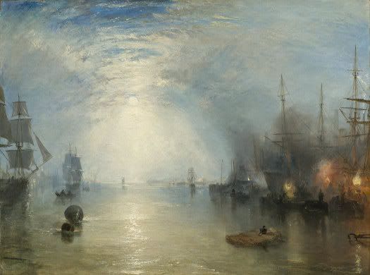
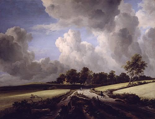
Where as, Turner’s “Keelmen Heaving in Coals by Moonlight was painted during the Modern Art period (1800 – 1945) which took place during the nineteenth century. This period allowed married women the ability to retain their own property. The movement for this artwork is Romanticism (1800-1850). Romantic works are marked by intense colors, turbulent emotions, complex composition, soft outlines, and sometimes heroic or exotic subject matter. (587) Turner’s style is representational. Representational is to create a likeness which is recognizable. (29) Both artists’ uses very strong theme or subject matter in their artwork.
Jasper Johns theme is Art and Art. Art and Art is where the purpose of the artwork serves to give visual pleasure. (76) This is an Art and Art theme because Johns uses horizontal, vertical, and diagonal lines to create shapes and to convey movement which serves to emphasis the numbers “0 through 9”. In contrast, Turner’s theme is Human Experience. The Human Experience is where the artist artwork is depicted by their life’s experiences. This is a Human Experience theme because the subject of this painting is keelmen hauling coal. Each artist uses various elements of design as well as design principles in the creation of their works of art.
Both artists used a host of visual elements in their artwork, such as lines, color, shape, texture, and atmospheric perspective. In Johns “0 through 9”, he utilizes horizontal, vertical, and diagonal lines to convey movement. Line is a path traced by a moving point. (82) When looking at this piece of artwork, lines are used to create the numbers 0 through 9. The functions of the diagonal lines are to create implied action thus allowing the viewer the ability to recognize the numbers. Another element used is shapes. The lines form the numbers which produces the shapes of the numbers allowing the viewer to see as well as recognize the shapes 0 through 9. Shapes are two-dimensional form with identifiable boundaries. (87) In addition, the color palette used by Johns is restricted. The only color he uses is black. Restricted palette is where artist limited themselves to a few pigments and their mixtures, tints, and shades within their artwork. (98)
In contrast, Turner uses the visual elements of color, value, texture, and atmospheric perspective. This painting uses atmospheric perspective. Atmospheric perspective is based on the observation that distant object appear less distinct, paler, and bluer than nearby objects due to the way moisture and the intervening atmosphere scatters light. (586) When looking at the light blue tint of the sky shining on the water, the buildings and ships appear to be less distinct, therefore, further away than the other ships. Another element Turner uses color. He uses the primary color blue to enhance the visual perspective of the image. Color is a function of light. (94) Turner also uses value in this painting. Value refers to relative lightness and darkness. (96) Value can be seen by the way Turner color (blue and white) to lighten and darken the sky; therefore, creating the illusion of moonlight breaking through the clouds to illuminates the sky and water. Another element used Turner is texture. Turner uses thick brushstrokes for the sky. This effect is seen when looking at the broken colors (blue and white) he uses for the sky.
Both artists use several principles of design which supports the design elements allowing them to create impressive pieces of artwork. The principles utilized by Johns include proportion and rhythm. Viewer viewing “0 through 9” immediately recognized there is proportion because the numbers are larger than what one expects to see. Normally when writing numbers on a sheet of paper, they are small, but Johns' numbers are large and he uses a serif font, which is normally seen on billboards. Proportion refers to size in relationship between parts of a whole. (137) Another principle he uses is rhythm. Rhythm is based on repetition. (141) Johns has created rhythm as he continuously repeats the horizontal, vertical, and diagonal lines use to create the shapes 0 through 9.
In contract, the principles utilized by Turner include emphasis, unity, and variety. Turner shows emphasis as he draws the viewer’s attention to the moon and its refection on the water. Emphasis means that our attention is drawn more to certain parts of a composition than others. (134) Turner also uses unity and variety in this painting by creating a visual harmony of the harbor and ships as well as the smoke coming from the torches. Unity is a sense of oneness, of things belonging together and making up a coherent whole. When looking at a harbor, one expects to see a body of water and ships at dock. In addition, they expect to see lit torches as a light source for the workers loading coal onto the ships. (122) Variety is the difference in the artwork which provides interest. (122) Viewer can recognize variety within this artwork when they look at lit torches as well as the illusion of light shining from the moonlight coming through the sky. Each painter has created very strong mood in the representation of their artwork.
Johns' artwork creates an entertaining and energetic mood using an everyday recognizable object as visual arts. He uses a serif font to create larger than normal size numbers for the viewer to try and recognize the numbers 0 through 9. In contract, Turner’s mood can be described as dramatic. Here you have men working on the dock doing hard manual labor of transporting coal onto the ships. Both artists presented totally different moods in their artwork. This difference is also seen in the mediums and techniques use by both artists.
The medium used in Johns “0 through 9” is lithography; a printmaking technique. Lithography is a planographic process, which means that the printing surface is flat – not raised as in relief or depressed as in intaglio. (200) Lithographic print is created by drawing the image on stone using a greasy material; “tusche”, and then using an acid based solution which enable the print to adhere to the stone thus preparing it for printing. Lithography is a remarkably flexible medium and capable of a broad range of effects. (202) This is seen by the way Johns uses thin lines to represent the numbers, “0 through 9”. The thin lines are black and embedded on the stone to create the overlapping of numerals.
In contract, Turner utilizes the medium of oil painting on canvas. An advantage of using oil is that it is a medium that can be worked in an almost infinite range of consistencies, from very thick to very thin. (175) This painting has areas in which Turner uses thick and thin brush strokes. This is especially the case when you look at the way he uses thick and thin brush strokes to represent the sky. For the moon’s reflection on the water, he uses heavy brush strokes. This technique is called “impasto”. Impasto is a technique from the Italian for “paste” where paint is layered thick. (175) This technique allows Turner to create the atmospheric perspective of the moon setting for the evening providing light while the keelmen work through the night. The differences are also the case when viewing the styles of these two artists.
The style used in Johns' artwork is abstract. Abstract style is represented by his use of abstract shapes and letters, and objects. In “0 through 9”, he has superimposed the ten digits which creates fragmented shapes which compete for your recognition of each numeral. In contrast, Turner who style is representational. Representational is to create a likeness which is recognizable. (29) In this artwork, one can easily recognize the sky, moon, water, and ships.
In conclusion, the two pieces of artwork are very different. This can be seen as we look at the period, movement, style, theme, design, and mediums of both pieces of artwork. When looking at these areas of art, there is no wonder to why these two pieces of art are different. Turner artwork was created in the 19th century during the Romanticism period and his style is considered to be representational art. On the other hand, Johns' artwork was created in the 20th century during the Abstract Expressionism period and his style is abstract art. Both artists use different themes for their works of art. Turner uses the theme of human experience where as Johns theme is art on art. The elements and principles uses by Turner are color, texture, and atmospheric perspective, emphasis, unity, and variety. Where as, the elements and principles used by Johns are lines, color, shape, proportion and rhythm. They also use different mediums as well as techniques in their artwork. The medium use by Turner is oil on canvas with thick brushstrokes where as Johns is lithograph using thin brushstrokes. Taking all these thing into account, there is no wonder why these two painters’ works are different.
Overall, I chose these two artworks because I found them to be very interesting. I especially enjoyed Johns work because I found it to be fascinating how he superimposed numbers and how easily they could be recognized. I chose Turners work because I have always enjoyed artwork where there is the illusion of distant.
Work Cited
Getlein, Mark. Living with Art. 8th ed. New York: McGraw-Hall, 2008.
Thursday, November 8, 2007
Re write Activity #9
The invention of the camera bought about many changes in visual art. Before camera, paintings, sculptures, and drawings were created by artists to record appearances and events; record history. (219) The use of photography was seen as freeing painting and sculpture from the task of recording history. (219) This is especially seen in the photos taken by John Heartfield of the political turnoil going on in the 1920s and 1930z. His photo created factual proof of what was going on during the war.
To have a painting done was very expensive. Therefore, the only people who were able to afford to have their image recorded was the rich. With the invention of cameras, it allowed ordinary people the opportunity to have their portrait recorded. Having their portrait taken was a luxury that they never had before. Cameras also allowed artists to get closer to their subjects, take pictures of moving images, as well as being able to capture light in a certain way creating perspective. Because of the use of cameras, painters such as Paul Cezanne, changed the way they painted by chopping the figures, showing the brush strokes, and using more color. In addition, cameras allowed artists the ability to reproduce the same artwork several times without them being different. Artists for the first time were able to record images of landscapes and cityscapes without fear of the image changing before the picture could be completed. Before camera, the artist would have their subject sit for days, sometimes for weeks or months as he or she worked to compose and execute a scene of daily life. (216) With the cameras, the subject only had to sit for a short period of time and the picture would be done.
To have a painting done was very expensive. Therefore, the only people who were able to afford to have their image recorded was the rich. With the invention of cameras, it allowed ordinary people the opportunity to have their portrait recorded. Having their portrait taken was a luxury that they never had before. Cameras also allowed artists to get closer to their subjects, take pictures of moving images, as well as being able to capture light in a certain way creating perspective. Because of the use of cameras, painters such as Paul Cezanne, changed the way they painted by chopping the figures, showing the brush strokes, and using more color. In addition, cameras allowed artists the ability to reproduce the same artwork several times without them being different. Artists for the first time were able to record images of landscapes and cityscapes without fear of the image changing before the picture could be completed. Before camera, the artist would have their subject sit for days, sometimes for weeks or months as he or she worked to compose and execute a scene of daily life. (216) With the cameras, the subject only had to sit for a short period of time and the picture would be done.
Wednesday, November 7, 2007
Activity #13
The artwork of an artist is influenced by his or her environment; therefore, art will often echo that of its time and place. In 1960, Jasper Johns created his lithograph “0 through 9”, using stone in black on Arches paper. Joseph Mallord William Turner created his oil on canvas painting the “Keelmen Heaving in Coals by Moonlight” in 1835. The information below will compare and contrast the movement, style as well as the period of these two pieces of artwork.
The 1960 lithograph “0 through 9” was created during the 20th-century. It was during this period that western art changed. And Abstract Expressionist artist such as Jasper Johns came to light. The movement represented by this artwork is Abstract Expressionism. Abstract Expressionism is an American art movement characterized by large scale and nonrepresentational imagery. (581) Johns arrived on the New York art scene as the abstract expressionism movement was about to end. The abstract expressionism movement represents a style which is considered to be different. His style is represented by his use of abstract shapes and letters, and objects. In “0 through 9”, he has superimposed all ten digits which creates fragmented shapes which compete for your recognition of each numeral.
The 1835 oil painting “Keelmen Heaving in Coals by Moonlight was painted during the Modern Art period which took place during the nineteenth century. The Modern Art period was between 1800 through 1945. The movement for this artwork is Romanticism (1800-1850). Romanticism is defined as a movement in Western art of the 19th century. Romantic works are marked by intense colors, turbulent emotions, complex composition, soft outlines, and sometimes heroic or exotic subject matter. (587) Turner is considered to be one of the greatest English Romantic landscape painters. In the “Keelmen Heaving in Coals by Moonlight”, he creates an atmospheric effects using light and color. This is effect is seen when looking at the way in which the moonlight breaks through the clouds to illuminate the sky and water. In addition, this effect is also created using the colors blue and white which creates the lighting and darkening effect of the sky which serves to illustrate the moonlight shining upon the water. Turner’s style is representational. Representational is to create a likeness which is recognizable. (29)
In conclusion, the two pieces of artwork chosen identifies two of the different movements in art history. Since both are from different movements, periods it is no wonder that the style used by each artist is different.
Wednesday, October 31, 2007
Activity #11 - Periods and Cultures
The artwork of an artist is influenced by his or her environment; therefore, art will often echo that of its time and place. In 1960, Jasper Johns created his lithograph “0 through 9”, using stone in black on Arches paper. Joseph Mallord William Turner created his oil on canvas painting the “Keelmen Heaving in Coals by Moonlight” in 1835. The information below will compare and contrast the periods and culture of these two pieces of artwork.
The 1960 lithograph “0 through 9” was created during the 20th-century. This period is signify the point when western art changes. It was during this period that Abstract Expressionism artists came to light. The culture of this period brought about the many changes to the Civil Rights movement. It is identified with the many sit-ins and peaceful protects organized by such leaders as Martin Luther King and Stokely Carmichael.
Where as, the 1835 oil painting “Keelmen Heaving in Coals by Moonlight was painted during the Modern Art period which took place during the nineteenth century. The Modern Art period was between 1800 through 1945. The culture of this period allowed married women the ability to retain their own property. It was also during this period that many technological changes took place in the world.
In conclusion, the two pieces of artwork chosen identifies two of the different periods in art history. Since both are from different periods, the cultures are dissimilar as well.
Wednesday, October 24, 2007
Activity #10 Mediums and Techniques
In 1960, Jasper Johns created “0 through 9”, using stone in black on Arches paper. The medium used is lithography. Lithography is a printmaking technique. Lithography was invented by Alois Senefelder a young German actor and playwright in the 1790s. (199) Lithography is a planographic process, which means that the printing surface is flat – not raised as in relief or depressed as in intaglio. (200) Lithographic print is created by drawing the image on stone using a greasy material; “tusche”, and then using an acid based solution which enable the print to adhere to the stone thus preparing it for printing. Lithography is a remarkably flexible medium and capable of a broad range of effects. (202) This is seen by the way Johns uses thin lines to represent the numbers, “0 through 9”. The thin lines are black and embedded on the stone to create the overlapping of numerals. When looking at the painting, your eyes are drawn to the visual elements of the diagonal lines Johns uses to convey direction and motion. (82) Thus, creating a surface which is considered to be active to anyone looking at the piece of artwork. When looking at this lithograph, one can see the importance of the numbers. Each represents a number which is unique from the others.
Joseph Mallord William Turner’s 1835 painting “Keelmen Heaving in Coals by Moonlight” utilizes the medium of oil painting on canvas. It is say that oil painting was invented in the 15th century and consist of pigment compounded with oil, usually linseed oil. (172) An advantage of oil is that it is a medium that can be worked in an almost infinite range of consistencies, from very thick to very thin. (175) This painting has areas in which Turner uses thick and thin brush strokes. This is especially the case when you look at the way he uses thick and thin brush strokes to represent the sky. For the moon’s reflection on the water, he uses heavy brush strokes. This technique is called “impasto”. Impasto is a technique from the Italian for “paste” where paint is layered thick. (175) This technique allows Turner to create the atmospheric perspective of the moon setting for the evening providing light while the keelmen work through the night. To accomplish this effect, Turner uses value to create lighting and darkening effect seen in the painting. Value is shades of light and dark (92) He also uses broken color by tinting the sky using blue and white paint.
In conclusion, both artists have created beautiful pieces of artwork. The medium used by Johns is lithograph while Turner uses oil on canvas.
Critical Thinking Essay - By Renee and Yvette
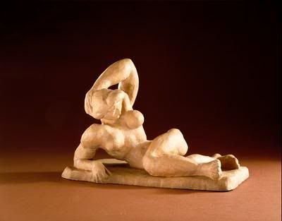
The two masterpieces that we would rescue from the Hirshhorn Museum and Sculpture Garden in Washington, DC before the meteorite hits and destroys the museum are “Reclining Nude I” and “Study of Portrait of Van Gogh III”. We selected the “Reclining Nude I” by Henri Matisse, in 1907, for its use of terra cota as the medium and the strong depiction of the female form. This sculpture symbolizes woman and her strength in body and soul to endure life and its many hardships. This is seen by the way Matisse sculpted the figure in a muscular form. Muscles usually symbolize strength. Therefore, one can assume that this woman is strong in character. Strength has normally been a characteristic associated with males. We also chose it for the strange way that the female figure is posed and the artist technique of rounding the breast and strong muscular features of the arms and hips. This type of pose is considered a “contrapposto, meaning counterpoise or counterbalance, which sets the body in a gentle S-shaped curve through a play of opposites” and if one was to stand over this piece, they would see the S-shape. (pg 279) Matisse use of monochromatic harmonies in this artwork brought out different aspects of the posed body, by using the rich cream color. This beautiful sculpture also represents a three dimensional space, as you follow the contours of the right arm, alongside the upper torso, around to the back of the sculpture. You are drawn right away to the upper torso, with the arm relaxed behind the head, giving emphasis to the perfectly rounded breasts. The next thing you notice is the chiseled physic of the female figure, which is unusual for a female. Matisse also tried to capture a more feminine look with the French hairstyle, creating a softer look around the facial features.
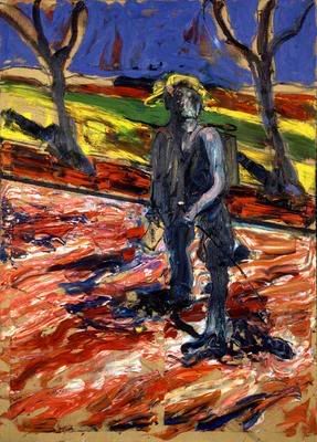
We selected to save the strange but interesting masterpiece by Francis Bacon, titled “Study for “Portrait of Van Gogh III”, in 1957, for an entirely different reason from why we chose the “Reclining Nude I”. We chose to save Bacon’s masterpiece because of the artist use of multiple mediums, oil paint and sand on linen, creating a grainy texture to the surface of the cloth. In addition, Bacon used brushstrokes which were bold and thick creating a layered surface which stands out in the art piece. To accomplish this effect, he used the technique called “impasto”. “Impasto is from the Italian for “paste”, a thick application of paint”. (pg 175) This created a landscape surface which appears to be smooth as well as rough in certain areas. The artist also used two different directional patterns in the foreground and background, giving the painting a distorted look. The stark contrast of the trees and male figure brings emphasis to the subject of Van Gogh, as a lonely figure walking along the road of life. This is also a great piece of art to be saved for future generations to aspire, with its use of vivid colors in his representation of the landscape. Bacon uses primary and secondary colors: red, yellow and green, to create a colorful composition with combination of blue representing the darkness of the sky.
In conclusion, these two wonderful masterpieces by Henri Matisse and Francis Bacon, were the only two that we would select to rescue from this terrible disaster at the museum, they really appealed to our sense of art design. The different mediums and techniques for both artworks allowed us to understand the subject of both pieces and detail the difference in design elements. The sculpture and the painting were both a thing of beauty to behold; artworks we would like to have in our homes.
Thursday, October 18, 2007

Wednesday, October 10, 2007
Activitty #7
The artwork in this exhibition represents the art theme “Art and Nature”. This exhibit features several pieces of art from various painters such as Albert Bierstadt, Frederic Edwin Church, Sanford Robinson Gifford, George Inness, Georgia O’Keefe, and Sergeev Vladimir whom work utilized the theme “Art and Nature”. Each piece is set using nature as its backdrop.
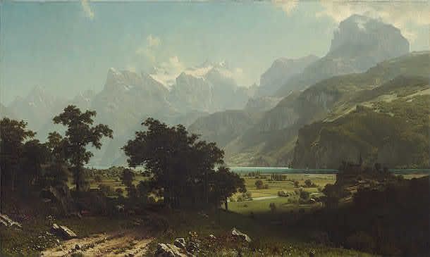
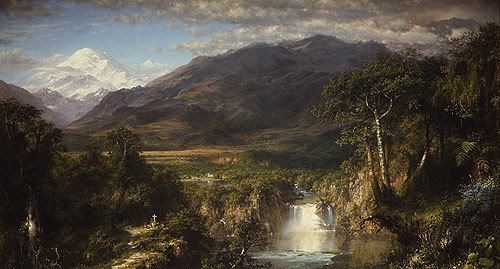
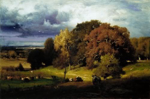
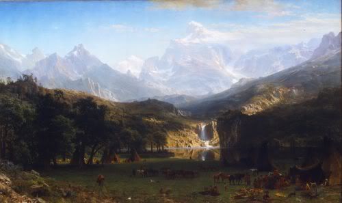
The exhibition will display the artwork of these six artists. Their work will be showcase in chronological order. The first showcase will contain two works of art by Albert Bierstadt (1830-1902); Lake Lucerne and The Rocky Mountains, Lander’s Peak. The second showcase will consist of two paintings by Frederic Edwin Church (1826 – 1900); El Rio de Luz (The River of Light) and Heat of the Andes. The third case will display Sanford Robinson Gifford (1823-1880), A Gorge in the Mountains (Kauterskill Clove). The fourth showcase will feature the work of George Inness (1825-1894); the Autumn Oaks. The fifth showcase is a painting by Georgia O’Keefe (1887-1986); Sky with Flat White Cloud. The final showcase will feature artwork by Sergeev Vladimir to include Mountain Motif and Evening Landscape both created in 2003.
Albert Bierstadt created his oil on canvas paintings The Rocky Mountains, Lander’s Peak in 1863 and Lake Lucerne in 1858. In both paintings, the elements Bierstadt uses are implied lines and atmospheric perspective. Both have mountains which appear to be farther away in the distance. They are blurred and misty shapes. In The Rocky Mountains, Lander's Peak, the color white is used to create the illusion of a waterfall with water cascading down the mountain to create a downward diagonal movement into to the stream below. The implied line of the water create the illusion of there being a stream that surrounds the mountain. In Lake Lucerne painting, there is a dirt road in which the eyes can follows through the trees.
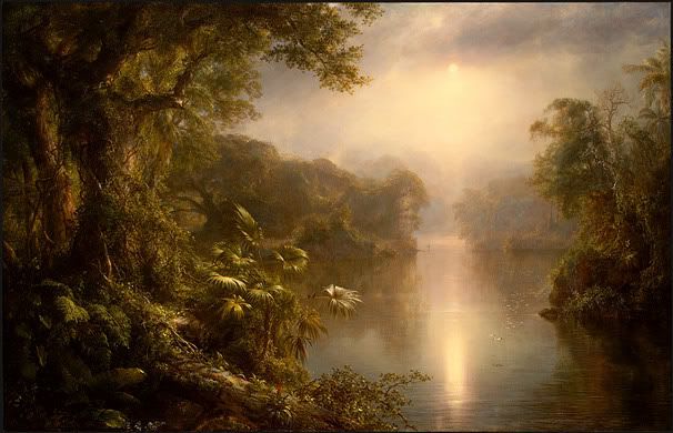
Frederic Edwin Church oil on canvas painting El Rio de Luz (The River of Light) in 1877, he has created a tropical rainforest setting in which the viewer can envision they have been given the opportunity to witness the dawn of creation itself. This is seen by the way Church has used the value of lightening and darkening the color of the sky.
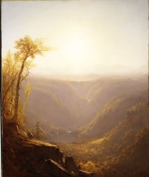
In 1862, Sanford Robinson Gifford created his oil on canvas painting A Gorge in the Mountains (Kauterskill Clove). The interesting element about this painting is Gifford’s use of movement. He used the value of lightening and darkening the sky to create the illusion that the clouds are moving. Another element he uses is implied diagonal lines. This is seen by looking at the pathway created by cows as their wander down to graze in the meadow. The grass where there is movement is bare.
George Inness in 1878 created his oil on canvas painting Autumn Oaks. This painting uses the element of atmospheric perspective where as the hills in the background are meant to appear farther away. When looking at the hills, they are blurred and misty; therefore, creating the appearance of being distance. He also has lightened the sky to create a focus point of being far off. There is also direction and movement by the lines implied when looking at the way the land appears to being moving down from left to right as well as the land background appearing to being going down.
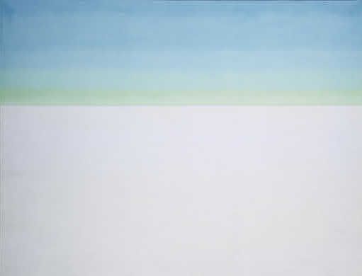
Georgia O’Keefe created her oil on canvas painting the “Sky with Flat White Cloud” in 1962. This paining demonstrates balance where as no one element dominates. This artwork depicts symmetrical balance. If an imaginary line was drawn down the middle, both sides would match up in size, shape, and placement.
Sergeev Vladimir created the paintings “Mountain Motif and Evening Landscape” both oil on canvas in 2003. In Mountain Motif, Vladimir uses primary and secondary colors; blue, red and green to represent the landscape, mountains and sky. He uses the element of intensity by the creating a duller shades of blue to create the illusion of the mountain appearing farther away in the distance. In Evening Landscape, he uses the primary color blue to represent the sky where as tertiary colors are used for the land, i.e. red-orange. To emphasis the hills in the background, Vladimir has made them standout, therefore, making them the focus point.
The exhibition will display the artwork of these six artists. Their work will be showcase in chronological order. The first showcase will contain two works of art by Albert Bierstadt (1830-1902); Lake Lucerne and The Rocky Mountains, Lander’s Peak. The second showcase will consist of two paintings by Frederic Edwin Church (1826 – 1900); El Rio de Luz (The River of Light) and Heat of the Andes. The third case will display Sanford Robinson Gifford (1823-1880), A Gorge in the Mountains (Kauterskill Clove). The fourth showcase will feature the work of George Inness (1825-1894); the Autumn Oaks. The fifth showcase is a painting by Georgia O’Keefe (1887-1986); Sky with Flat White Cloud. The final showcase will feature artwork by Sergeev Vladimir to include Mountain Motif and Evening Landscape both created in 2003.
Albert Bierstadt created his oil on canvas paintings The Rocky Mountains, Lander’s Peak in 1863 and Lake Lucerne in 1858. In both paintings, the elements Bierstadt uses are implied lines and atmospheric perspective. Both have mountains which appear to be farther away in the distance. They are blurred and misty shapes. In The Rocky Mountains, Lander's Peak, the color white is used to create the illusion of a waterfall with water cascading down the mountain to create a downward diagonal movement into to the stream below. The implied line of the water create the illusion of there being a stream that surrounds the mountain. In Lake Lucerne painting, there is a dirt road in which the eyes can follows through the trees.
Frederic Edwin Church oil on canvas painting El Rio de Luz (The River of Light) in 1877, he has created a tropical rainforest setting in which the viewer can envision they have been given the opportunity to witness the dawn of creation itself. This is seen by the way Church has used the value of lightening and darkening the color of the sky.
In 1862, Sanford Robinson Gifford created his oil on canvas painting A Gorge in the Mountains (Kauterskill Clove). The interesting element about this painting is Gifford’s use of movement. He used the value of lightening and darkening the sky to create the illusion that the clouds are moving. Another element he uses is implied diagonal lines. This is seen by looking at the pathway created by cows as their wander down to graze in the meadow. The grass where there is movement is bare.
George Inness in 1878 created his oil on canvas painting Autumn Oaks. This painting uses the element of atmospheric perspective where as the hills in the background are meant to appear farther away. When looking at the hills, they are blurred and misty; therefore, creating the appearance of being distance. He also has lightened the sky to create a focus point of being far off. There is also direction and movement by the lines implied when looking at the way the land appears to being moving down from left to right as well as the land background appearing to being going down.
Georgia O’Keefe created her oil on canvas painting the “Sky with Flat White Cloud” in 1962. This paining demonstrates balance where as no one element dominates. This artwork depicts symmetrical balance. If an imaginary line was drawn down the middle, both sides would match up in size, shape, and placement.
Sergeev Vladimir created the paintings “Mountain Motif and Evening Landscape” both oil on canvas in 2003. In Mountain Motif, Vladimir uses primary and secondary colors; blue, red and green to represent the landscape, mountains and sky. He uses the element of intensity by the creating a duller shades of blue to create the illusion of the mountain appearing farther away in the distance. In Evening Landscape, he uses the primary color blue to represent the sky where as tertiary colors are used for the land, i.e. red-orange. To emphasis the hills in the background, Vladimir has made them standout, therefore, making them the focus point.
Activity #6 - Mid-Term
Theme: Art and Nature
Albert Bierstadt
Lake Lucerne, 1858
Oil on canvas
Borrowed from the National Gallery of Art
Frederic Edwin Church (1826 - 1900)
Heart of the Andes, 1859
Oil on canvas
Borrowed from the Metropolitan Museum of Art
Sanford Robinson Gifford (1823-1880)
A Gorge in the Mountains (Kauterskill Clove), 1862
Oil on canvas
Borrowed from the Metropolitan Museum of Art
Albert Bierstadt (1830-1902)
The Rocky Mountains, Lander's Peak, 1863
Oil on canvas
Borrowed from the Metropolitan Museum of Art
Frederic Edwin Church (1826 - 1900)
El Rio de Luz (The River of Light), 1877
Oil on canvas
Borrowed from the National Gallery of Art
George Inness (1825-1894)
Autumn Oaks, ca. 1878
Oil on canvas
Borrowed from the Metropolitan Museum of Art
Georgia O'Keeffe (1887 - 1986)
Sky with Flat White Cloud, 1962
oil on canvas
Borrowed from the National Gallery of Art
Sergeev Vladimir
Mountain Motif, 2003
Oil on canvas
Borrowed from the Amsterdam Art Gallery
Sergeev Vladimir
Evening Landscape, 2003
Oil on canvas
Borrowed from the Amsterdam Art Gallery
Wednesday, October 3, 2007
Activity #5
The two artworks I chose for my Online Museum Visit represents two entirely different themes. Jasper Johns' lithograph “0 through 9” created in 1960 represents an art and art theme. While Joseph Mallord William Turner oil on canvas painting the “Keelmen Heaving in Coals by Moonlight” in 1835 represents art in nature theme.
Johns’ “0 through 9” lithograph represents an art and art theme, where the purpose of the artwork serves to give visual pleasure. (76) In this piece, Johns’ uses lines to create shapes and movement which serves to emphasis the numbers “0 through 9”. His lines are diagonal which implies action.
Turner’s painting “Keelmen Heaving in Coals by Moonlight” represents the theme “art and nature”. He depicts the environment from his point of view. This is seen by his use of the colors orange and white to create the frames used to provide light to assist in the transfer of coal from one ship to another. Nature is represented by the illusion of moonlight breaking through the clouds to illuminate the sky and water. He creates this effect using the colors blue and white to create the lighting and darkening effect of the sky. This value serves to emphasis the sky a focus point.
Wednesday, September 26, 2007
Activity #4:
In 1960, Jasper Johns created his lithograph “0 through 9”, using stone in black on Arches paper. His lithograph uses several principles of design which supports the design elements to create an impressive piece of art work. The principles utilized include proportion, rhythm, and balance.
Viewers viewing “0 through 9” immediately recognized there is proportion. The lines which form the numbers cover the whole paper. Proportion refers to size in relationship between parts of a whole. (137) The many lines used to in creating the numbers “0 through 9” create rhythm. Rhythm is based on repetition. (141) Those viewing “0 through 9” are immediately drawn to the visual weight of the lithograph being equally distributed. Johns employs symmetrical balance. By placing an imaginary line down the middle, one can see the sides are equal. Symmetrical balance is equal weight. (125)
Joseph Mallord William Turner created his oil on canvas painting the “Keelmen Heaving in Coals by Moonlight” in 1835. Turner uses the design principles of emphasis, unity, and variety to support the design elements in his painting.
In this painting, Turner uses emphasis which grabs the viewer attention with the moon, and its reflection on the water leads the way to it. This can be seen by Turner's use of color to lighten and darken the sky. Emphasis means that our attention is drawn more to certain parts of a composition than others. (134) Turner also uses unity and variety in this painting by creating a visual harmony of the harbor and ships as well as the smoke coming from the coal mines. Unity is a sense of oneness, of things belonging together and making up a coherent whole. (122) Variety is the difference in the art work which provides interest. (122)
In conclusion, both pictures use very different principles. Jasper Johns art work exhibits symmetrical balance in contrast to Turner. Turner uses emphasis in his painting to draw attention to certain parts while Johns does not.
Monday, September 24, 2007
Creative Blog
Wheat Fields, ca. 1670 Jacob Isaacksz. van Ruisdael (Dutch, 1628/29–1682)
I throught this was a beautiful picture because of the trees in the distance and the many clouds in the sky which appear to be moving. This picture is an example of Asymmetrical Balance where as the two sides do not match although they appear to.
______________________________________________
Georges Fouquet (French, 1862 – 1957), Designer Corsage Ornament. ca. 1923. Jade, onyx, diamonds, enamel, and platinum
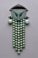
This is not a beautiful piece of art as much as it is usual. It is a perfect example of Symmetrical Balance because if you place a line down the middle, both sides would be mirrored.
______________________________________________
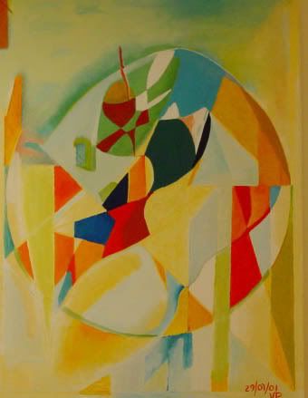
Universe by Vladimir Panian
oil painting on canvas
I choose this picture because I liked the way the artist used shapes and colors as his visual elements. This picture uses the visual elements of primary and secordary colors as well shapes.
______________________________________________
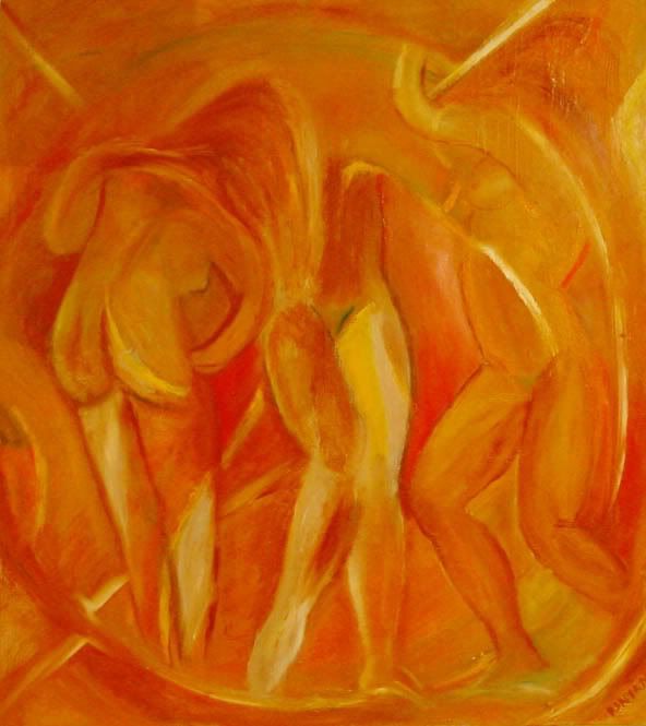
Swirl by Vladimir Panian
oil painting on canvas
I choose this picture because of the implied shapes the artist uses to create the shape of the people. The visual elements of this picture is its use of the primary color yellow and secondary color of orange.
_______________________________________________
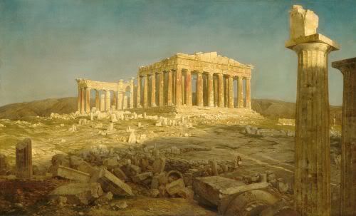
I like the way the artist chose to display the ruin buildings. In this painting, the artist use monochromatic harmonies. He uses one color thoughout the artwork. The artist also uses value by drawing the viewer eyes to look upon the only standing structure.
_______________________________________________
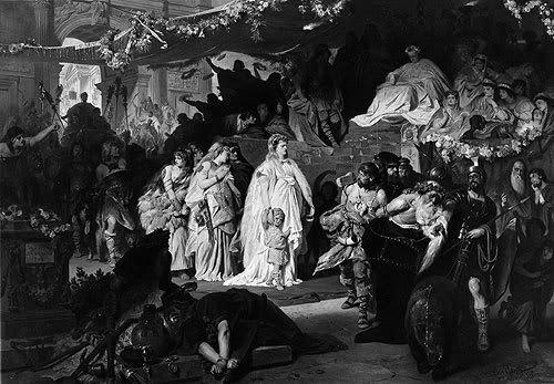
Thusnelda at the Triumphal Entry of Germanicus into Rome, ca. 1875
Karl Theodor von Piloty (German, 1826–1886)
I thought this was a very interesting painting. There is so much to see. I especially liked the way Theodor von Piloty created the value of lighting and darkening to emphasis the woman and child in the center of the painting.
________________________________________________
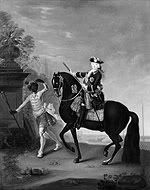
The Empress Elizabeth of Russia (1709–1762) on Horseback, Attended by a Page
Georg Christoph Grooth (German, 1716–1749)
Oil on canvas
I chose this picture because when we were reading about themes in artwork, I felt this picture was a perfect example of the social order theme. You have the Page attending to the Empress Elizabeth needs.
_______________________________________________
Christ and the Adulteress, mid-1540s
Lucas Cranach the Elder (German, 1472–1553)
Oil on wood
I chose this painting because it portrays an woman adulteress as the men look on to bear witness. The design element used in the artwork is implied line. This is seen by the way in which the hand is used to point to the woman adulteress.
_______________________________________________
The Martyrdom of Saint Barbara, ca. 1510
Lucas Cranach the Elder (German, 1472–1553)
Oil on wood
I chose this picture because it shows the Martyrdom as she is about to be executed as several men look on. The artist uses monochromatic harmony as the design element in this painting.
_________________________________________________

Henry MooreBritish, b. Castleford, England, 1898 - 1986
Family Group: Maquette No. 4, (1944, cast 1956)Bronze
This is an interesting piece to me because when I look at it I see family and togetherness. This piece represents a 3 dimensional element of design.
___________________________________________________
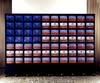
Nam June Paik
American, b. Seoul, Korea, 1932 - 2006
Video Flag, (1985-1996)
70 video monitors, 4 laser disc players, computer, timers, electrical devices, wood and metal housing on rubber wheels
I find this to be a very interesting piece of artwork because the monitors and other equipment is used to represent the American flag as well serving as an educational tool. There is a continuous run of every U.S. president from Harry S. Truman to Bill Clinton. The design element used is pattern being repeated.
______________________________________________________
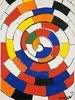
Alexander Calder
American, b. Lawnton, Pennsylvania, 1898 - 1976
Spiral, 1970
Gouache and ink on paper
I chose this artwork because of its spiraling effect which is created by the implied diagonal lines. The other elements of design Calder used are his repeated pattern and use of primary and secondary colors.
_____________________________________________________
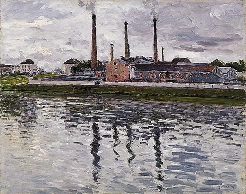
Gustave Caillebotte, Factories at Argenteuil, 1888
I like this picutre because you can see the reflections on the water. The artist uses thick brush strokes to create the water and sky. The technique is impasto.
______________________________________________________
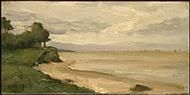
Jean-Baptiste-Camille Corot
French, 1796 - 1875
Beach near Etretat, c. 1872
oil on canvas
This is a beautiful beach and I especially liked Corot use of thick brush strokes in creating the landscapes of the beach (sand and greeny).
______________________________________________________
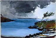
Winslow Homer, American, 1836 - 1910
The Coming Storm, 1901
watercolor over graphite
I looked at this picture and I was able to determine the medium used prior to looking at the artwork description. He uses primary color blue for the water.
______________________________________________________
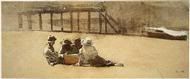
Winslow Homer, American, 1836 - 1910
Four Boys on a Beach, c. 1873
graphite with watercolor and gouache on wove paper
I like this painting because of the kids on the beach sitting on the sand.
______________________________________________________
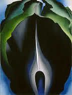
Georgia O'Keeffe, American, 1887 - 1986
Jack-in-the-Pulpit No. IV, 1930, oil on canvas
I chose to put some of O'Keeffe artwork on display because I love the way she takes the simpliest subject/object and creates a great work of art. This is a beautiful abstract look at a flower. Below our some other pieces of artwork by her.
_______________________________________________________
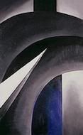
Georgia O'Keeffe, American, 1887 - 1986
Black White and Blue, 1930, oil on canvas
O'Keeffe uses the design elements of vertical and diagonal lines for movement and direction. The diagonal lines imply action.
_____________________________________________________
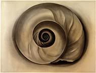
Georgia O'Keeffe, American, 1887 - 1986
The Shell, 1934, charcoal on laid paper
For this artwork, O'Keeffe uses the color harmony of monochromatic harmony. In this composition she uses one color to create the color of the shell.
_____________________________________________________
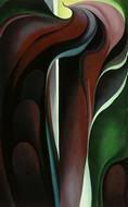
Georgia O'Keeffe, American, 1887 - 1986
Jack-in-Pulpit Abstraction - No. 5, 1930, oil on canvas
O'Keeffe uses primary and secondary colors; red and green.
_____________________________________________________
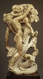
Bacchanal: A Faun Teased by Children, 17th century (ca. 1616–17)
Gian Lorenzo Bernini (1598-1680), Sculptor
I choose this sculptor because of the details Bernini put in creating the faun and children. The element of design used is three dimensional. Bernini used implied lines to draw your attention to the children he is playing with.
_____________________________________________________
I chose the next three paintings because they were done during the Romanticism movement in art history. Each is a beautiful piece of artwork.
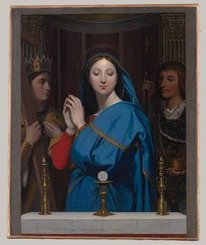
The Virgin Adoring the Host, 1852
I found this to be an interesting painting of the Virgin. In this painting, the artist uses primary colors of blue and red to draw your eyes to the virgin. The artist also uses value. The image of the virgin is lighten while the figures to the right or left are darken.
____________________________________________________
 Jean-Auguste-Dominique Ingres (French, 1780–1867), Oil on canvas
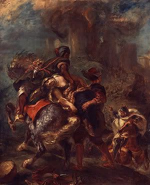
The Abduction of Rebecca, 1846
Eugène Delacroix (French, 1798–1863)
Oil on canvas
This is an interesting painting. The artist uses primary color red as well as implied lines to create movement and direction. You see this when looking at the direction of the hand.
______________________________________________________
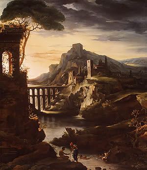 Evening: Landscape with an Aqueduct, 1818
Jean-Louis-André-Théodore Gericault (French, 1791–1824)
Oil on canvas
I especially like the way the artist shows value by drawing your attention out to the distant.
____________________________________________________

This is such a beautiful bed and breakfast. Looking at this picture makes going there very inviting. I especially like the way the lights focus in on the windows.
_______________________________________________________
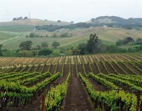
I like this picture because of the vineyards. This picture has implied lines allowing your eyes to follow the path of the vineyard. I also like the atmospheric perspective of seeing the rolls of vineyard in the distance.
___________________________________________________________
I chose Durand because he also does landscapes. Below are two beautiful pieces from him. I just enjoy the atmospheric perspective element of art which is used in both these paintings. The viewers eyes are drawn to look at the mountains in the distance. They appear farther away in the distance are blurred, become indistinct and misty. He also uses secondary color green. In addition, he uses the design element value; lighten or darken to highlight the cows grazing as well as the body of water.
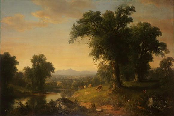
Asher Brown Durand
American, 1796 - 1886
A Pastoral Scene, 1858
oil on canvas
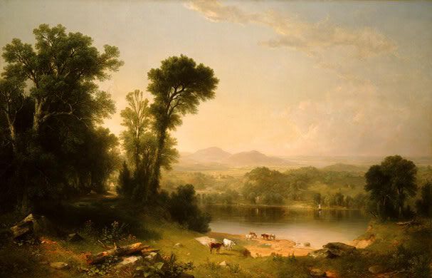
Asher Brown Durand
American, 1796 - 1886
Pastoral Landscape, 1861
oil on canvas
_____________________________________________________
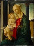
Sandro Botticelli
Florentine, 1446 - 1510
Madonna and Child, c. 1470
tempera on panel,
This is a beautiful painting. The prinicple of design is emphasis. The viewer is immediately drawn to Madonna and the Child. They are the focus point of the painting. Botticelli uses primary colors of blue and red for Madonna's clothing.
_______________________________________________________
Florentine, 1446 - 1510
The Adoration of the Magi, c. 1478/1482
tempera and oil on panel, painted surface
I chose this painting because of the religious aspect is stressed. You see this looking at the people as they neil in prayer. Element of design use is color. Florentine use primary and secondary colors. Design principle used is emphasis. The structure in the middle of the painting stands out from the people as the neil in pray.
I throught this was a beautiful picture because of the trees in the distance and the many clouds in the sky which appear to be moving. This picture is an example of Asymmetrical Balance where as the two sides do not match although they appear to.
______________________________________________
Georges Fouquet (French, 1862 – 1957), Designer Corsage Ornament. ca. 1923. Jade, onyx, diamonds, enamel, and platinum
This is not a beautiful piece of art as much as it is usual. It is a perfect example of Symmetrical Balance because if you place a line down the middle, both sides would be mirrored.
______________________________________________
Universe by Vladimir Panian
oil painting on canvas
I choose this picture because I liked the way the artist used shapes and colors as his visual elements. This picture uses the visual elements of primary and secordary colors as well shapes.
______________________________________________
Swirl by Vladimir Panian
oil painting on canvas
I choose this picture because of the implied shapes the artist uses to create the shape of the people. The visual elements of this picture is its use of the primary color yellow and secondary color of orange.
_______________________________________________
I like the way the artist chose to display the ruin buildings. In this painting, the artist use monochromatic harmonies. He uses one color thoughout the artwork. The artist also uses value by drawing the viewer eyes to look upon the only standing structure.
_______________________________________________
Thusnelda at the Triumphal Entry of Germanicus into Rome, ca. 1875
Karl Theodor von Piloty (German, 1826–1886)
I thought this was a very interesting painting. There is so much to see. I especially liked the way Theodor von Piloty created the value of lighting and darkening to emphasis the woman and child in the center of the painting.
________________________________________________
The Empress Elizabeth of Russia (1709–1762) on Horseback, Attended by a Page
Georg Christoph Grooth (German, 1716–1749)
Oil on canvas
I chose this picture because when we were reading about themes in artwork, I felt this picture was a perfect example of the social order theme. You have the Page attending to the Empress Elizabeth needs.
_______________________________________________
Christ and the Adulteress, mid-1540s
Lucas Cranach the Elder (German, 1472–1553)
Oil on wood
I chose this painting because it portrays an woman adulteress as the men look on to bear witness. The design element used in the artwork is implied line. This is seen by the way in which the hand is used to point to the woman adulteress.
_______________________________________________
The Martyrdom of Saint Barbara, ca. 1510
Lucas Cranach the Elder (German, 1472–1553)
Oil on wood
I chose this picture because it shows the Martyrdom as she is about to be executed as several men look on. The artist uses monochromatic harmony as the design element in this painting.
_________________________________________________
Henry MooreBritish, b. Castleford, England, 1898 - 1986
Family Group: Maquette No. 4, (1944, cast 1956)Bronze
This is an interesting piece to me because when I look at it I see family and togetherness. This piece represents a 3 dimensional element of design.
___________________________________________________
Nam June Paik
American, b. Seoul, Korea, 1932 - 2006
Video Flag, (1985-1996)
70 video monitors, 4 laser disc players, computer, timers, electrical devices, wood and metal housing on rubber wheels
I find this to be a very interesting piece of artwork because the monitors and other equipment is used to represent the American flag as well serving as an educational tool. There is a continuous run of every U.S. president from Harry S. Truman to Bill Clinton. The design element used is pattern being repeated.
______________________________________________________
Alexander Calder
American, b. Lawnton, Pennsylvania, 1898 - 1976
Spiral, 1970
Gouache and ink on paper
I chose this artwork because of its spiraling effect which is created by the implied diagonal lines. The other elements of design Calder used are his repeated pattern and use of primary and secondary colors.
_____________________________________________________
Gustave Caillebotte, Factories at Argenteuil, 1888
I like this picutre because you can see the reflections on the water. The artist uses thick brush strokes to create the water and sky. The technique is impasto.
______________________________________________________
Jean-Baptiste-Camille Corot
French, 1796 - 1875
Beach near Etretat, c. 1872
oil on canvas
This is a beautiful beach and I especially liked Corot use of thick brush strokes in creating the landscapes of the beach (sand and greeny).
______________________________________________________
Winslow Homer, American, 1836 - 1910
The Coming Storm, 1901
watercolor over graphite
I looked at this picture and I was able to determine the medium used prior to looking at the artwork description. He uses primary color blue for the water.
______________________________________________________
Winslow Homer, American, 1836 - 1910
Four Boys on a Beach, c. 1873
graphite with watercolor and gouache on wove paper
I like this painting because of the kids on the beach sitting on the sand.
______________________________________________________
Georgia O'Keeffe, American, 1887 - 1986
Jack-in-the-Pulpit No. IV, 1930, oil on canvas
I chose to put some of O'Keeffe artwork on display because I love the way she takes the simpliest subject/object and creates a great work of art. This is a beautiful abstract look at a flower. Below our some other pieces of artwork by her.
_______________________________________________________
Georgia O'Keeffe, American, 1887 - 1986
Black White and Blue, 1930, oil on canvas
O'Keeffe uses the design elements of vertical and diagonal lines for movement and direction. The diagonal lines imply action.
_____________________________________________________
Georgia O'Keeffe, American, 1887 - 1986
The Shell, 1934, charcoal on laid paper
For this artwork, O'Keeffe uses the color harmony of monochromatic harmony. In this composition she uses one color to create the color of the shell.
_____________________________________________________
Georgia O'Keeffe, American, 1887 - 1986
Jack-in-Pulpit Abstraction - No. 5, 1930, oil on canvas
O'Keeffe uses primary and secondary colors; red and green.
_____________________________________________________
Bacchanal: A Faun Teased by Children, 17th century (ca. 1616–17)
Gian Lorenzo Bernini (1598-1680), Sculptor
I choose this sculptor because of the details Bernini put in creating the faun and children. The element of design used is three dimensional. Bernini used implied lines to draw your attention to the children he is playing with.
_____________________________________________________
I chose the next three paintings because they were done during the Romanticism movement in art history. Each is a beautiful piece of artwork.
The Virgin Adoring the Host, 1852
I found this to be an interesting painting of the Virgin. In this painting, the artist uses primary colors of blue and red to draw your eyes to the virgin. The artist also uses value. The image of the virgin is lighten while the figures to the right or left are darken.
____________________________________________________
Jean-Auguste-Dominique Ingres (French, 1780–1867), Oil on canvasThe Abduction of Rebecca, 1846
Eugène Delacroix (French, 1798–1863)
Oil on canvas
This is an interesting painting. The artist uses primary color red as well as implied lines to create movement and direction. You see this when looking at the direction of the hand.
______________________________________________________
Evening: Landscape with an Aqueduct, 1818Jean-Louis-André-Théodore Gericault (French, 1791–1824)
Oil on canvas
I especially like the way the artist shows value by drawing your attention out to the distant.
____________________________________________________
This is such a beautiful bed and breakfast. Looking at this picture makes going there very inviting. I especially like the way the lights focus in on the windows.
_______________________________________________________
I like this picture because of the vineyards. This picture has implied lines allowing your eyes to follow the path of the vineyard. I also like the atmospheric perspective of seeing the rolls of vineyard in the distance.
___________________________________________________________
I chose Durand because he also does landscapes. Below are two beautiful pieces from him. I just enjoy the atmospheric perspective element of art which is used in both these paintings. The viewers eyes are drawn to look at the mountains in the distance. They appear farther away in the distance are blurred, become indistinct and misty. He also uses secondary color green. In addition, he uses the design element value; lighten or darken to highlight the cows grazing as well as the body of water.
Asher Brown Durand
American, 1796 - 1886
A Pastoral Scene, 1858
oil on canvas
Asher Brown Durand
American, 1796 - 1886
Pastoral Landscape, 1861
oil on canvas
_____________________________________________________
Sandro Botticelli
Florentine, 1446 - 1510
Madonna and Child, c. 1470
tempera on panel,
This is a beautiful painting. The prinicple of design is emphasis. The viewer is immediately drawn to Madonna and the Child. They are the focus point of the painting. Botticelli uses primary colors of blue and red for Madonna's clothing.
_______________________________________________________
Florentine, 1446 - 1510
The Adoration of the Magi, c. 1478/1482
tempera and oil on panel, painted surface
I chose this painting because of the religious aspect is stressed. You see this looking at the people as they neil in prayer. Element of design use is color. Florentine use primary and secondary colors. Design principle used is emphasis. The structure in the middle of the painting stands out from the people as the neil in pray.
Wednesday, September 19, 2007
Activity #2: Write About It!
In 1960, Jasper Johns created his lithograph “0 through 9”, using stone in black on Arches paper. Johns employs lines in his lithograph. The lines are used to record the borders of the form in addition to conveying direction and motion. (83) By looking at the lines in the lithograph, one is able to recognized the diagonal lines; therefore, allowing the eyes to make out the numbers from 0 through 9. Johns also uses shapes. The shapes are two-dimensional with identifiable boundaries which allow us to see the numbers. (87)
Joseph Mallord William Turner created his oil on canvas painting the “Keelmen Heaving in Coals by Moonlight” in 1835. This painting uses the effects of atmospheric perspective in illustrating the illusion of moonlight breaking through the clouds to illuminates the sky and water. (113) Turner also uses light and color in this painting. Color is a function of light. (94) By using blue and white, Turner is able to show lightness and darkness within his painting.
The two pieces of art work I have chosen for this activity are very different. Where Johns art work is a collection of lines which convey direction and motion, Turner painting emphases the use of color as well as atmospheric perspective.
Tuesday, September 18, 2007
Activity #1
Joseph Mallord William Turner Keelmen Heaving in Coals by Moonlight, 1835
Jasper Johns (b. 1930) 0 through 9, 1960 lithograph (stone) in black on Arches paper
Jasper Johns (b. 1930) 0 through 9, 1960 lithograph (stone) in black on Arches paper
Subscribe to:
Posts (Atom)