Monday, November 12, 2007
EXTRA CREDIT
The color relationship of the "Assignment" list on Black Board consist of primary, secondary, and tertiary colors. Weeks 2 and 8 uses the primary color of red. While weeks 6 and 10 uses primary color of yellow. Week 4 uses the primary color of blue. Week 3 uses secondary color of orange. If you open the assignment for a specific week, for example Intro week one, you see primary colors of blue, and secondary colors of orange, green, and voilet. Where as week five, you will notice that the colors used are pink, light green, light blue, and purple which are tertiary colors. Tertiary colors are created when you mix primary and secondary colors together.
Sunday, November 11, 2007
ART 101 FINAL EXAM - MUSEUM PAPER
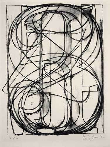
American born artist, Jasper Johns created his lithograph “0 through 9” in 1960, using stone in black on Arches paper. Joseph Mallord William Turner, British born, created his oil on canvas painting the “Keelmen Heaving in Coals by Moonlight” in 1835. Johns “0 through 9” was created during the 20th-century. This period brought about the many changes to take place during the Civil Rights movement such as sit-in and peaceful protects organized by such leaders as Martin Luther King and Stokely Carmichael. This period also signify the point when western art changes and Abstract Expressionism artists came to light. The movement represented by this artwork is American Abstract Expressionism with Johns' style being abstract.
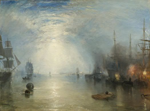
Where as, Turner’s “Keelmen Heaving in Coals by Moonlight was painted during the Modern Art period (1800 – 1945) which took place during the nineteenth century. This period allowed married women the ability to retain their own property. The movement for this artwork is Romanticism (1800-1850). Romantic works are marked by intense colors, turbulent emotions, complex composition, soft outlines, and sometimes heroic or exotic subject matter. (587) Turner’s style is representational. Representational is to create a likeness which is recognizable. (29) Both artists’ uses very strong theme or subject matter in their artwork.
Jasper Johns theme is Art and Art. Art and Art is where the purpose of the artwork serves to give visual pleasure. (76) This is an Art and Art theme because Johns uses horizontal, vertical, and diagonal lines to create shapes and to convey movement which serves to emphasis the numbers “0 through 9”. In contrast, Turner’s theme is Human Experience. The Human Experience is where the artist artwork is depicted by their life’s experiences. This is a Human Experience theme because the subject of this painting is keelmen hauling coal. Each artist uses various elements of design as well as design principles in the creation of their works of art.
Both artists used a host of visual elements in their artwork, such as lines, color, shape, texture, and atmospheric perspective. In Johns “0 through 9”, he utilizes horizontal, vertical, and diagonal lines to convey movement. Line is a path traced by a moving point. (82) When looking at this piece of artwork, lines are used to create the numbers 0 through 9. The functions of the diagonal lines are to create implied action thus allowing the viewer the ability to recognize the numbers. Another element used is shapes. The lines form the numbers which produces the shapes of the numbers allowing the viewer to see as well as recognize the shapes 0 through 9. Shapes are two-dimensional form with identifiable boundaries. (87) In addition, the color palette used by Johns is restricted. The only color he uses is black. Restricted palette is where artist limited themselves to a few pigments and their mixtures, tints, and shades within their artwork. (98)
In contrast, Turner uses the visual elements of color, value, texture, and atmospheric perspective. This painting uses atmospheric perspective. Atmospheric perspective is based on the observation that distant object appear less distinct, paler, and bluer than nearby objects due to the way moisture and the intervening atmosphere scatters light. (586) When looking at the light blue tint of the sky shining on the water, the buildings and ships appear to be less distinct, therefore, further away than the other ships. Another element Turner uses color. He uses the primary color blue to enhance the visual perspective of the image. Color is a function of light. (94) Turner also uses value in this painting. Value refers to relative lightness and darkness. (96) Value can be seen by the way Turner color (blue and white) to lighten and darken the sky; therefore, creating the illusion of moonlight breaking through the clouds to illuminates the sky and water. Another element used Turner is texture. Turner uses thick brushstrokes for the sky. This effect is seen when looking at the broken colors (blue and white) he uses for the sky.
Both artists use several principles of design which supports the design elements allowing them to create impressive pieces of artwork. The principles utilized by Johns include proportion and rhythm. Viewer viewing “0 through 9” immediately recognized there is proportion because the numbers are larger than what one expects to see. Normally when writing numbers on a sheet of paper, they are small, but Johns' numbers are large and he uses a serif font, which is normally seen on billboards. Proportion refers to size in relationship between parts of a whole. (137) Another principle he uses is rhythm. Rhythm is based on repetition. (141) Johns has created rhythm as he continuously repeats the horizontal, vertical, and diagonal lines use to create the shapes 0 through 9.
In contract, the principles utilized by Turner include emphasis, unity, and variety. Turner shows emphasis as he draws the viewer’s attention to the moon and its refection on the water. Emphasis means that our attention is drawn more to certain parts of a composition than others. (134) Turner also uses unity and variety in this painting by creating a visual harmony of the harbor and ships as well as the smoke coming from the torches. Unity is a sense of oneness, of things belonging together and making up a coherent whole. When looking at a harbor, one expects to see a body of water and ships at dock. In addition, they expect to see lit torches as a light source for the workers loading coal onto the ships. (122) Variety is the difference in the artwork which provides interest. (122) Viewer can recognize variety within this artwork when they look at lit torches as well as the illusion of light shining from the moonlight coming through the sky. Each painter has created very strong mood in the representation of their artwork.
Johns' artwork creates an entertaining and energetic mood using an everyday recognizable object as visual arts. He uses a serif font to create larger than normal size numbers for the viewer to try and recognize the numbers 0 through 9. In contract, Turner’s mood can be described as dramatic. Here you have men working on the dock doing hard manual labor of transporting coal onto the ships. Both artists presented totally different moods in their artwork. This difference is also seen in the mediums and techniques use by both artists.
The medium used in Johns “0 through 9” is lithography; a printmaking technique. Lithography is a planographic process, which means that the printing surface is flat – not raised as in relief or depressed as in intaglio. (200) Lithographic print is created by drawing the image on stone using a greasy material; “tusche”, and then using an acid based solution which enable the print to adhere to the stone thus preparing it for printing. Lithography is a remarkably flexible medium and capable of a broad range of effects. (202) This is seen by the way Johns uses thin lines to represent the numbers, “0 through 9”. The thin lines are black and embedded on the stone to create the overlapping of numerals.
In contract, Turner utilizes the medium of oil painting on canvas. An advantage of using oil is that it is a medium that can be worked in an almost infinite range of consistencies, from very thick to very thin. (175) This painting has areas in which Turner uses thick and thin brush strokes. This is especially the case when you look at the way he uses thick and thin brush strokes to represent the sky. For the moon’s reflection on the water, he uses heavy brush strokes. This technique is called “impasto”. Impasto is a technique from the Italian for “paste” where paint is layered thick. (175) This technique allows Turner to create the atmospheric perspective of the moon setting for the evening providing light while the keelmen work through the night. The differences are also the case when viewing the styles of these two artists.
The style used in Johns' artwork is abstract. Abstract style is represented by his use of abstract shapes and letters, and objects. In “0 through 9”, he has superimposed the ten digits which creates fragmented shapes which compete for your recognition of each numeral. In contrast, Turner who style is representational. Representational is to create a likeness which is recognizable. (29) In this artwork, one can easily recognize the sky, moon, water, and ships.
In conclusion, the two pieces of artwork are very different. This can be seen as we look at the period, movement, style, theme, design, and mediums of both pieces of artwork. When looking at these areas of art, there is no wonder to why these two pieces of art are different. Turner artwork was created in the 19th century during the Romanticism period and his style is considered to be representational art. On the other hand, Johns' artwork was created in the 20th century during the Abstract Expressionism period and his style is abstract art. Both artists use different themes for their works of art. Turner uses the theme of human experience where as Johns theme is art on art. The elements and principles uses by Turner are color, texture, and atmospheric perspective, emphasis, unity, and variety. Where as, the elements and principles used by Johns are lines, color, shape, proportion and rhythm. They also use different mediums as well as techniques in their artwork. The medium use by Turner is oil on canvas with thick brushstrokes where as Johns is lithograph using thin brushstrokes. Taking all these thing into account, there is no wonder why these two painters’ works are different.
Overall, I chose these two artworks because I found them to be very interesting. I especially enjoyed Johns work because I found it to be fascinating how he superimposed numbers and how easily they could be recognized. I chose Turners work because I have always enjoyed artwork where there is the illusion of distant.
Work Cited
Getlein, Mark. Living with Art. 8th ed. New York: McGraw-Hall, 2008.
Thursday, November 8, 2007
Re write Activity #9
The invention of the camera bought about many changes in visual art. Before camera, paintings, sculptures, and drawings were created by artists to record appearances and events; record history. (219) The use of photography was seen as freeing painting and sculpture from the task of recording history. (219) This is especially seen in the photos taken by John Heartfield of the political turnoil going on in the 1920s and 1930z. His photo created factual proof of what was going on during the war.
To have a painting done was very expensive. Therefore, the only people who were able to afford to have their image recorded was the rich. With the invention of cameras, it allowed ordinary people the opportunity to have their portrait recorded. Having their portrait taken was a luxury that they never had before. Cameras also allowed artists to get closer to their subjects, take pictures of moving images, as well as being able to capture light in a certain way creating perspective. Because of the use of cameras, painters such as Paul Cezanne, changed the way they painted by chopping the figures, showing the brush strokes, and using more color. In addition, cameras allowed artists the ability to reproduce the same artwork several times without them being different. Artists for the first time were able to record images of landscapes and cityscapes without fear of the image changing before the picture could be completed. Before camera, the artist would have their subject sit for days, sometimes for weeks or months as he or she worked to compose and execute a scene of daily life. (216) With the cameras, the subject only had to sit for a short period of time and the picture would be done.
To have a painting done was very expensive. Therefore, the only people who were able to afford to have their image recorded was the rich. With the invention of cameras, it allowed ordinary people the opportunity to have their portrait recorded. Having their portrait taken was a luxury that they never had before. Cameras also allowed artists to get closer to their subjects, take pictures of moving images, as well as being able to capture light in a certain way creating perspective. Because of the use of cameras, painters such as Paul Cezanne, changed the way they painted by chopping the figures, showing the brush strokes, and using more color. In addition, cameras allowed artists the ability to reproduce the same artwork several times without them being different. Artists for the first time were able to record images of landscapes and cityscapes without fear of the image changing before the picture could be completed. Before camera, the artist would have their subject sit for days, sometimes for weeks or months as he or she worked to compose and execute a scene of daily life. (216) With the cameras, the subject only had to sit for a short period of time and the picture would be done.
Wednesday, November 7, 2007
Activity #13
The artwork of an artist is influenced by his or her environment; therefore, art will often echo that of its time and place. In 1960, Jasper Johns created his lithograph “0 through 9”, using stone in black on Arches paper. Joseph Mallord William Turner created his oil on canvas painting the “Keelmen Heaving in Coals by Moonlight” in 1835. The information below will compare and contrast the movement, style as well as the period of these two pieces of artwork.
The 1960 lithograph “0 through 9” was created during the 20th-century. It was during this period that western art changed. And Abstract Expressionist artist such as Jasper Johns came to light. The movement represented by this artwork is Abstract Expressionism. Abstract Expressionism is an American art movement characterized by large scale and nonrepresentational imagery. (581) Johns arrived on the New York art scene as the abstract expressionism movement was about to end. The abstract expressionism movement represents a style which is considered to be different. His style is represented by his use of abstract shapes and letters, and objects. In “0 through 9”, he has superimposed all ten digits which creates fragmented shapes which compete for your recognition of each numeral.
The 1835 oil painting “Keelmen Heaving in Coals by Moonlight was painted during the Modern Art period which took place during the nineteenth century. The Modern Art period was between 1800 through 1945. The movement for this artwork is Romanticism (1800-1850). Romanticism is defined as a movement in Western art of the 19th century. Romantic works are marked by intense colors, turbulent emotions, complex composition, soft outlines, and sometimes heroic or exotic subject matter. (587) Turner is considered to be one of the greatest English Romantic landscape painters. In the “Keelmen Heaving in Coals by Moonlight”, he creates an atmospheric effects using light and color. This is effect is seen when looking at the way in which the moonlight breaks through the clouds to illuminate the sky and water. In addition, this effect is also created using the colors blue and white which creates the lighting and darkening effect of the sky which serves to illustrate the moonlight shining upon the water. Turner’s style is representational. Representational is to create a likeness which is recognizable. (29)
In conclusion, the two pieces of artwork chosen identifies two of the different movements in art history. Since both are from different movements, periods it is no wonder that the style used by each artist is different.
Wednesday, October 31, 2007
Activity #11 - Periods and Cultures
The artwork of an artist is influenced by his or her environment; therefore, art will often echo that of its time and place. In 1960, Jasper Johns created his lithograph “0 through 9”, using stone in black on Arches paper. Joseph Mallord William Turner created his oil on canvas painting the “Keelmen Heaving in Coals by Moonlight” in 1835. The information below will compare and contrast the periods and culture of these two pieces of artwork.
The 1960 lithograph “0 through 9” was created during the 20th-century. This period is signify the point when western art changes. It was during this period that Abstract Expressionism artists came to light. The culture of this period brought about the many changes to the Civil Rights movement. It is identified with the many sit-ins and peaceful protects organized by such leaders as Martin Luther King and Stokely Carmichael.
Where as, the 1835 oil painting “Keelmen Heaving in Coals by Moonlight was painted during the Modern Art period which took place during the nineteenth century. The Modern Art period was between 1800 through 1945. The culture of this period allowed married women the ability to retain their own property. It was also during this period that many technological changes took place in the world.
In conclusion, the two pieces of artwork chosen identifies two of the different periods in art history. Since both are from different periods, the cultures are dissimilar as well.
Wednesday, October 24, 2007
Activity #10 Mediums and Techniques
In 1960, Jasper Johns created “0 through 9”, using stone in black on Arches paper. The medium used is lithography. Lithography is a printmaking technique. Lithography was invented by Alois Senefelder a young German actor and playwright in the 1790s. (199) Lithography is a planographic process, which means that the printing surface is flat – not raised as in relief or depressed as in intaglio. (200) Lithographic print is created by drawing the image on stone using a greasy material; “tusche”, and then using an acid based solution which enable the print to adhere to the stone thus preparing it for printing. Lithography is a remarkably flexible medium and capable of a broad range of effects. (202) This is seen by the way Johns uses thin lines to represent the numbers, “0 through 9”. The thin lines are black and embedded on the stone to create the overlapping of numerals. When looking at the painting, your eyes are drawn to the visual elements of the diagonal lines Johns uses to convey direction and motion. (82) Thus, creating a surface which is considered to be active to anyone looking at the piece of artwork. When looking at this lithograph, one can see the importance of the numbers. Each represents a number which is unique from the others.
Joseph Mallord William Turner’s 1835 painting “Keelmen Heaving in Coals by Moonlight” utilizes the medium of oil painting on canvas. It is say that oil painting was invented in the 15th century and consist of pigment compounded with oil, usually linseed oil. (172) An advantage of oil is that it is a medium that can be worked in an almost infinite range of consistencies, from very thick to very thin. (175) This painting has areas in which Turner uses thick and thin brush strokes. This is especially the case when you look at the way he uses thick and thin brush strokes to represent the sky. For the moon’s reflection on the water, he uses heavy brush strokes. This technique is called “impasto”. Impasto is a technique from the Italian for “paste” where paint is layered thick. (175) This technique allows Turner to create the atmospheric perspective of the moon setting for the evening providing light while the keelmen work through the night. To accomplish this effect, Turner uses value to create lighting and darkening effect seen in the painting. Value is shades of light and dark (92) He also uses broken color by tinting the sky using blue and white paint.
In conclusion, both artists have created beautiful pieces of artwork. The medium used by Johns is lithograph while Turner uses oil on canvas.
Critical Thinking Essay - By Renee and Yvette
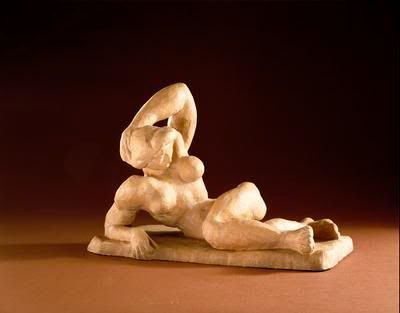
The two masterpieces that we would rescue from the Hirshhorn Museum and Sculpture Garden in Washington, DC before the meteorite hits and destroys the museum are “Reclining Nude I” and “Study of Portrait of Van Gogh III”. We selected the “Reclining Nude I” by Henri Matisse, in 1907, for its use of terra cota as the medium and the strong depiction of the female form. This sculpture symbolizes woman and her strength in body and soul to endure life and its many hardships. This is seen by the way Matisse sculpted the figure in a muscular form. Muscles usually symbolize strength. Therefore, one can assume that this woman is strong in character. Strength has normally been a characteristic associated with males. We also chose it for the strange way that the female figure is posed and the artist technique of rounding the breast and strong muscular features of the arms and hips. This type of pose is considered a “contrapposto, meaning counterpoise or counterbalance, which sets the body in a gentle S-shaped curve through a play of opposites” and if one was to stand over this piece, they would see the S-shape. (pg 279) Matisse use of monochromatic harmonies in this artwork brought out different aspects of the posed body, by using the rich cream color. This beautiful sculpture also represents a three dimensional space, as you follow the contours of the right arm, alongside the upper torso, around to the back of the sculpture. You are drawn right away to the upper torso, with the arm relaxed behind the head, giving emphasis to the perfectly rounded breasts. The next thing you notice is the chiseled physic of the female figure, which is unusual for a female. Matisse also tried to capture a more feminine look with the French hairstyle, creating a softer look around the facial features.
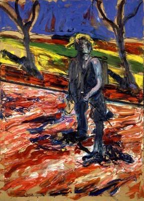
We selected to save the strange but interesting masterpiece by Francis Bacon, titled “Study for “Portrait of Van Gogh III”, in 1957, for an entirely different reason from why we chose the “Reclining Nude I”. We chose to save Bacon’s masterpiece because of the artist use of multiple mediums, oil paint and sand on linen, creating a grainy texture to the surface of the cloth. In addition, Bacon used brushstrokes which were bold and thick creating a layered surface which stands out in the art piece. To accomplish this effect, he used the technique called “impasto”. “Impasto is from the Italian for “paste”, a thick application of paint”. (pg 175) This created a landscape surface which appears to be smooth as well as rough in certain areas. The artist also used two different directional patterns in the foreground and background, giving the painting a distorted look. The stark contrast of the trees and male figure brings emphasis to the subject of Van Gogh, as a lonely figure walking along the road of life. This is also a great piece of art to be saved for future generations to aspire, with its use of vivid colors in his representation of the landscape. Bacon uses primary and secondary colors: red, yellow and green, to create a colorful composition with combination of blue representing the darkness of the sky.
In conclusion, these two wonderful masterpieces by Henri Matisse and Francis Bacon, were the only two that we would select to rescue from this terrible disaster at the museum, they really appealed to our sense of art design. The different mediums and techniques for both artworks allowed us to understand the subject of both pieces and detail the difference in design elements. The sculpture and the painting were both a thing of beauty to behold; artworks we would like to have in our homes.
Subscribe to:
Posts (Atom)